From 16 to 18 October, we were in London for the Pentawards ceremony. An evening full of fellow designers and remarkable projects that took home awards. And since we were in London anyway, we naturally made time to explore the city itself. We spent the weekend immersing ourselves in the shelves of department stores, food halls and concept stores. And, of course, in my favourite cafés.
01. Strikingly illustrative
01. Strikingly illustrative
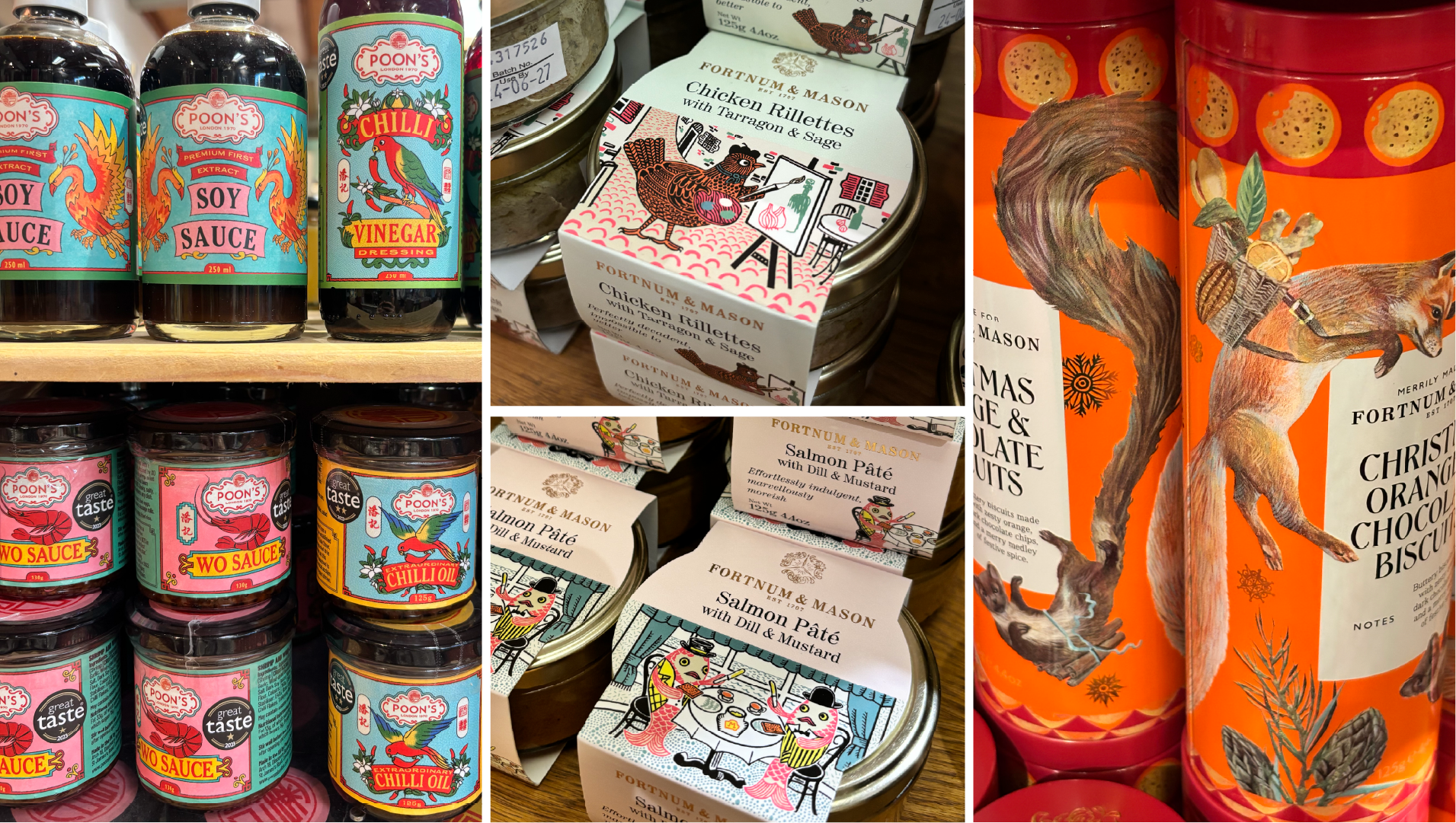
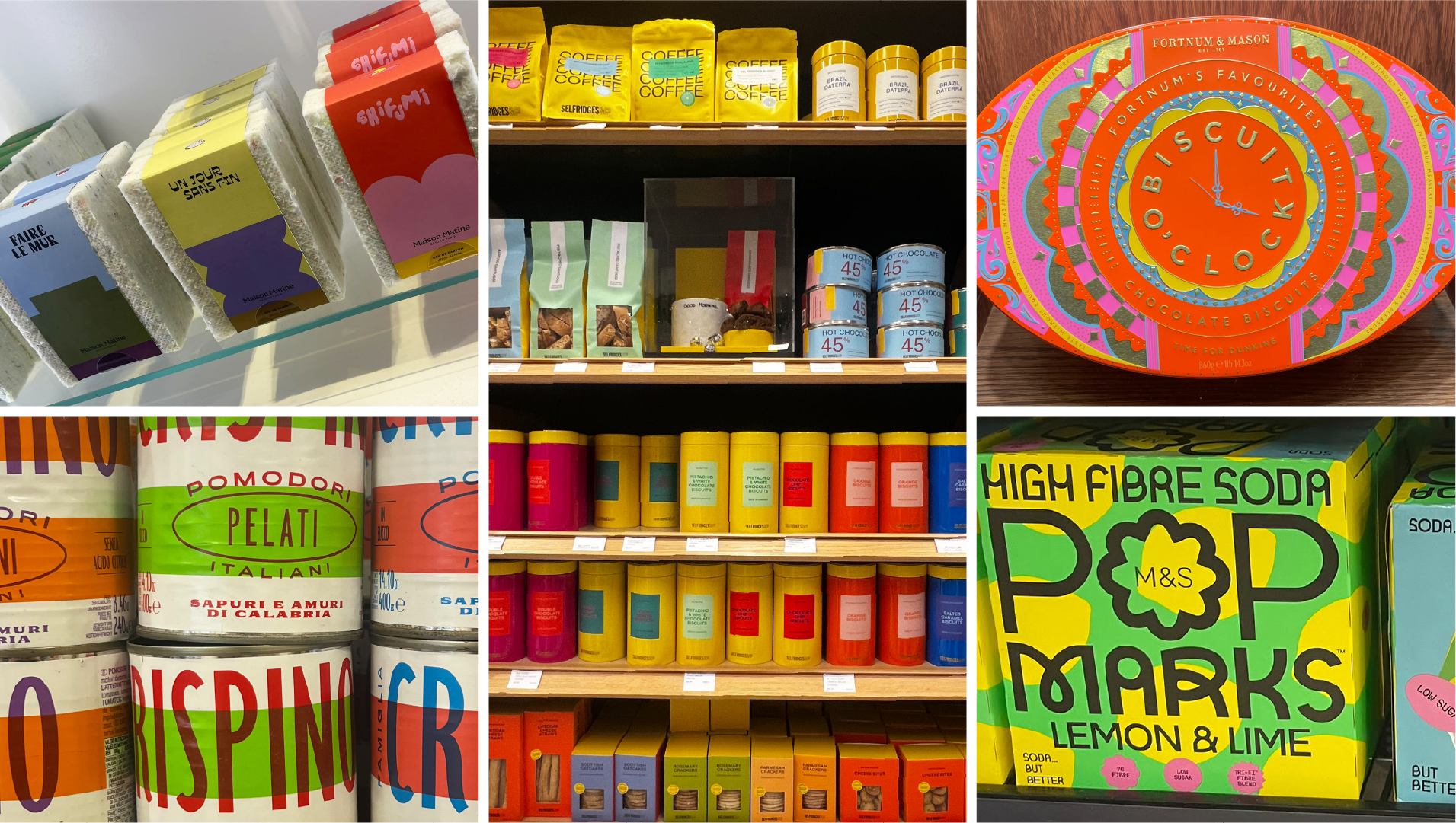
Illustration was perhaps the common thread running through all the inspiration we gathered. Not as decoration tucked away in a corner, but as the heart of the packaging. At Fortnum & Mason in particular, it felt like stepping into a world of illustrations, where they tell the story. On the Chicken Rillettes, a chicken stands at an easel; on the salmon pâté, two salmon sit neatly at the table. Humour and a story at a single glance. The coffee packaging featuring a leopard and the biscuit tins decorated with animals also show how illustration instantly gives a product its own character. The jars from Poon's that we spotted at Selfridges are another great example. Their labels are reminiscent of vintage Chinese and Hong Kong print and tin packaging, but thanks to modern illustrations and bold use of colour, they really pop off the shelf.
02. Colourful contrasts
02. Colourful contrasts
In the British design world, colour is seen as a statement. We saw plenty of packaging with bold colour combinations and minimalist designs. What's great is that these colour contrasts don't just work on a single pack. It's precisely when they're lined up or stacked together that they form a recognisable block you can spot from a distance.
03. Modern Heritage
03. Modern Heritage
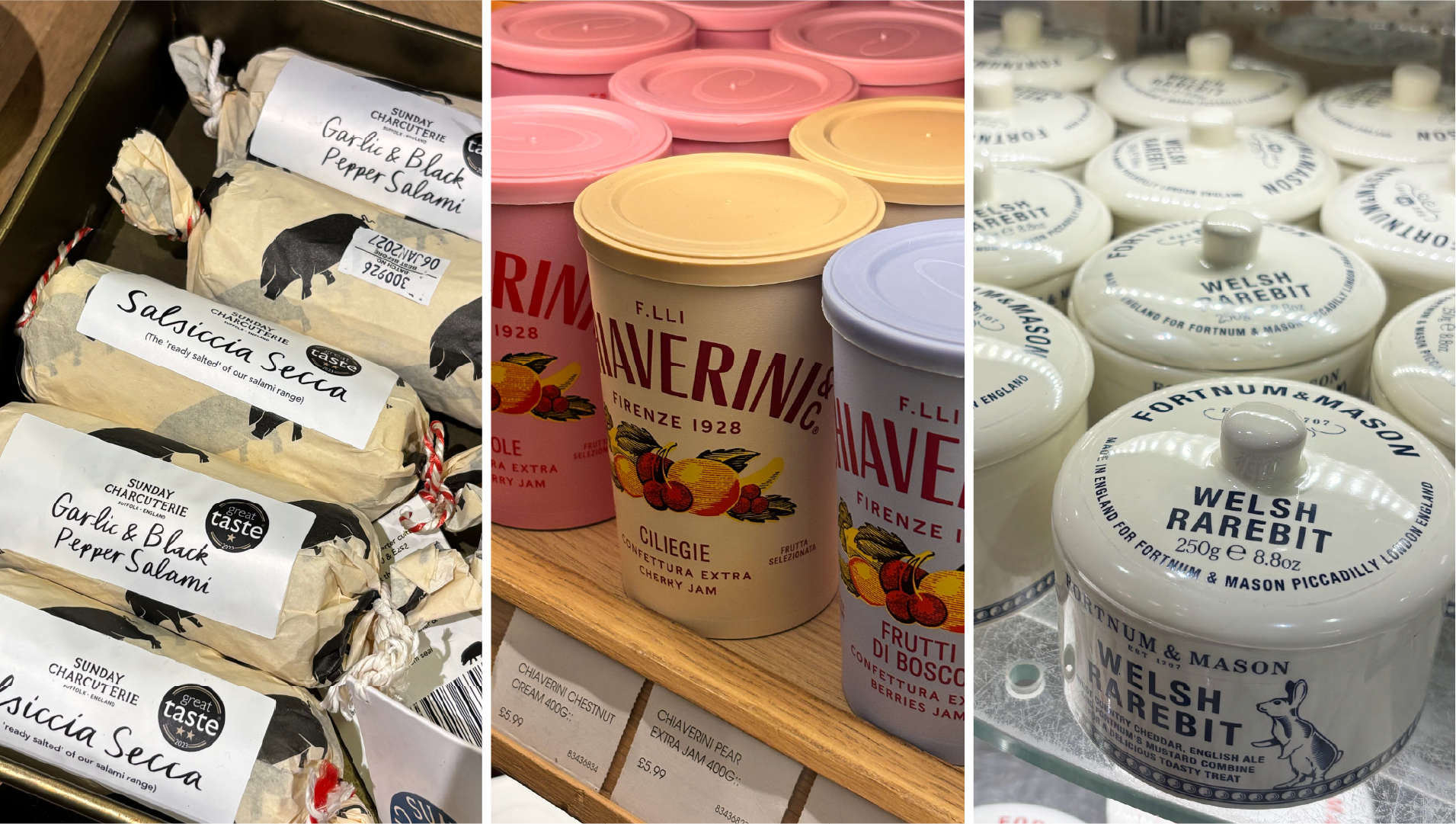
Many brands play cleverly with their heritage without looking "dusty". Tradition and craftsmanship remain visible, but the execution feels contemporary. We saw this, for example, in Fortnum & Mason's ceramic Welsh Rarebit pots: a classic shape featuring a playful little rabbit. And Sunday Charcuterie's salamis, wrapped in paper with script typography and crisp illustrations, show how craft can be translated into a modern look and feel.
04. Typography takes the lead
04. Typography takes the lead
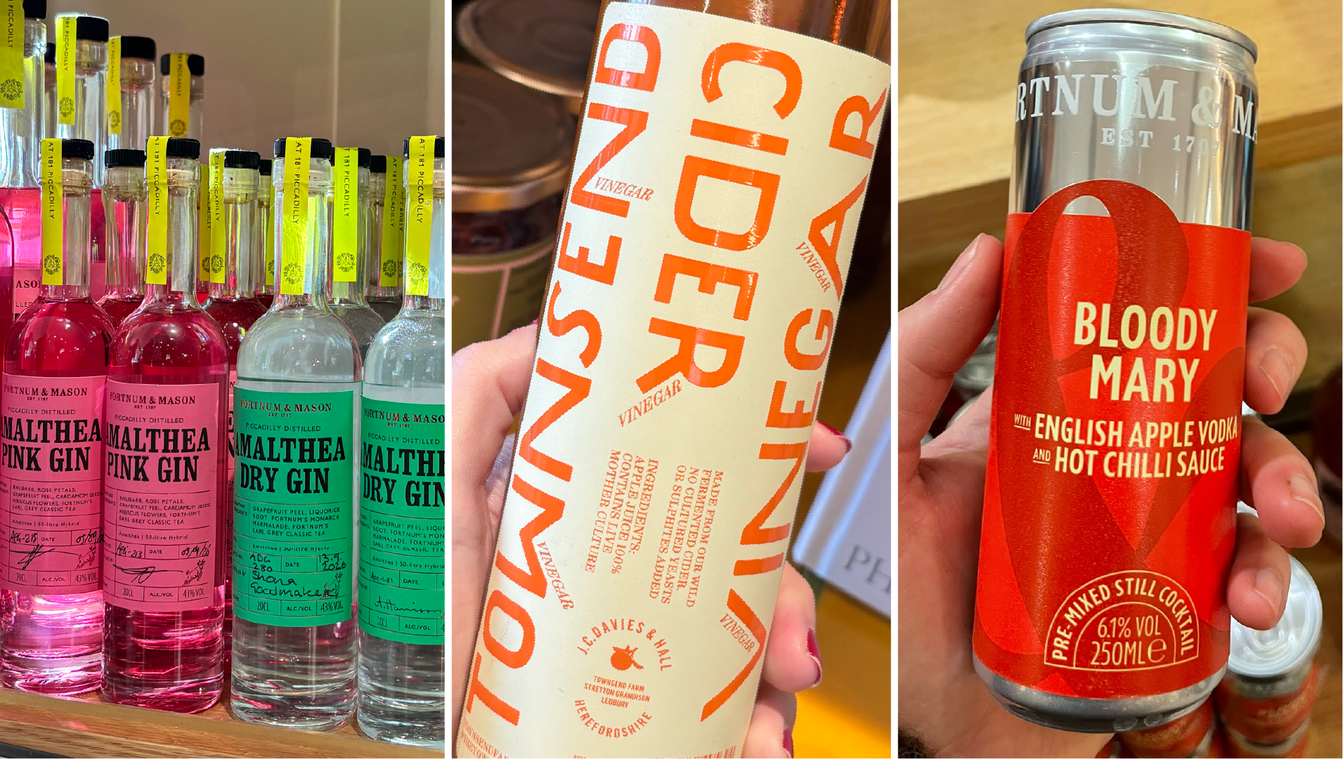
Sometimes you don't need imagery to make great packaging: the font does all the work. We saw packaging where typography plays the leading role. Fortnum & Mason's gin bottles, for instance, with their clean, brightly coloured labels finished off with handwritten notes. We also came across designs with bold lettering or, by contrast, elegant serif typefaces.
A tour of the shops
A tour of the shops
Every shop had a character all its own. These are the places where we found the most inspiration:
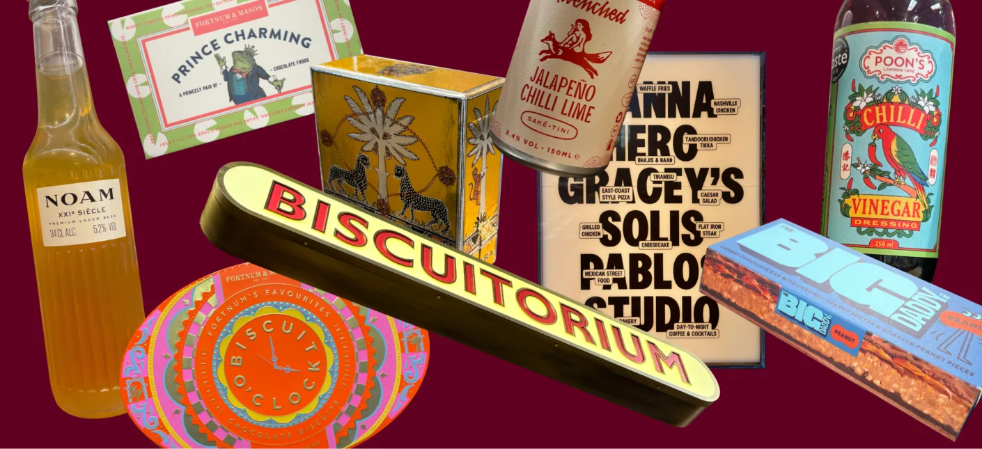
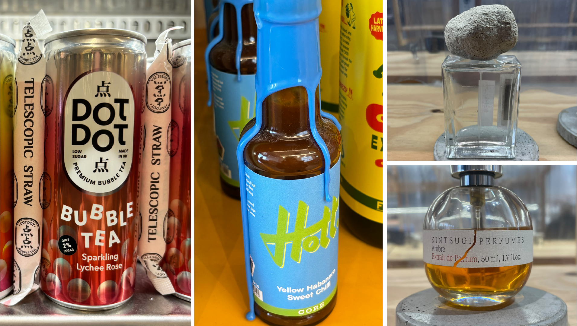
The Selfridges Food Hall is the place to be for new and unusual brands. Among others, we spotted Cha Dong with its eye-catching bottle shape, Dot Dot bubble tea in a can with a telescopic straw, and Noam beer, whose label design is almost reminiscent of a beautiful perfume. Lots of brands that dare to experiment with form and function.
Fortnum & Mason is perhaps the ultimate example of a brand that keeps reinventing its heritage. From the Biscuit O'Clock tin to the Prince Charming boxes filled with chocolate frogs, to its very own Biscuitorium. Every piece of packaging is full of richness and detail.
M&S Food proves that a private label can have a strong personality too. The beer aisle is an explosion of colour, and even something as simple as food colouring comes in clean, graphic packaging.
Goodhood is a curated concept store where design takes centre stage. Here we saw the artistic side of packaging: perfume bottles by Kintsugi Perfumes, inspired by the Japanese art of kintsugi; a bottle with a stone for a cap; and hot sauce packaging with a cap that looks as if it's melting and dripping down the bottle. Here, each piece of packaging is almost a work of art rather than a commercial product.
…and more!
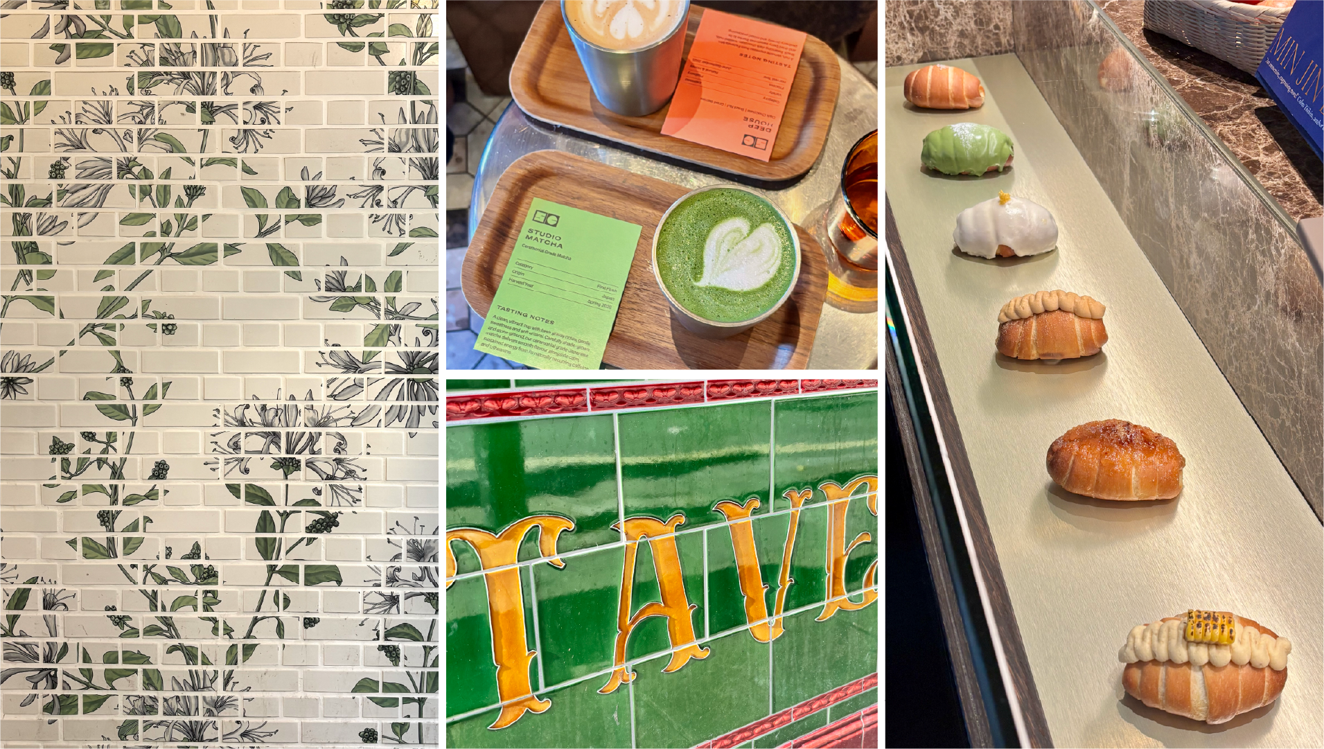
For me, inspiration doesn't only come from browsing shelves or packaging designs, but also from details on the street, café interiors and the way food is presented.
We visited Studio Coffee, a café that had been on my list for quite some time. What I find interesting about it is the way it gives mid-century modern style a contemporary twist, in both the interior and the branding. You could see it in the furniture, the colours, the graphic menu boards and even the lattes, which were served on a small wooden tray with a colourful tasting-note card. Beyond that, London is full of details that have stood the test of time for decades. I spotted green tiles with golden-yellow lettering on the façade of an old tavern, and tiled walls with botanical motifs at an Underground station. But refinement didn't escape my notice on this trip either. At the Korean café Tokkia, the buns were displayed like little sculptures in a glass case. No image or text on a menu, just the real product tempting you in.
What we took with us
We came home with heads full of inspiration and phones full of photos. London showed us that good packaging dares to tell a story through illustration, to go all in on bold colour, or to let typography do the talking. Whether it's a luxury department store or a supermarket shelf, the packaging that stands out always has a distinct character of its own.