In the wonderful world of craft beer, you see a wide variety in design, color, style, and flavors. This allows for creativity but also presents a significant challenge: how do you stand out in such a versatile shelf? We got to work for Gulpener and figured it out.
The challenge
Craft beer has seen tremendous growth in the recent years. Consumers are seeking new, experimental flavors and want a unique experience. That's why it was time for Gulpener to introduce a craft beer collection. And so, we were put to work. The idea: to produce a trendy range of craft beers in four surprising flavors. Our task was to come up with the names and a refreshing design.
But how do you stand out on a shelf where there's already a wide variety of designs, styles, colors and flavors?
The solution: the name of the game
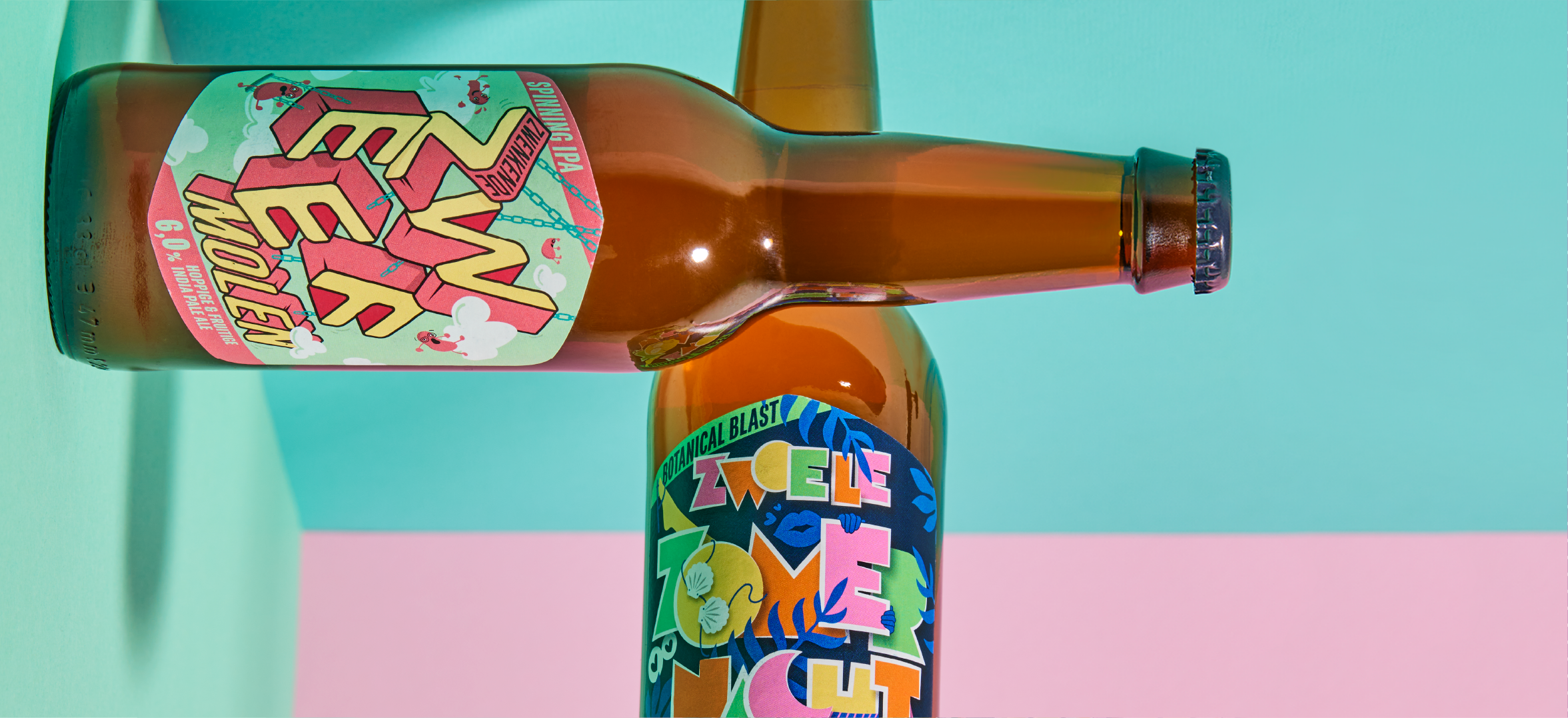
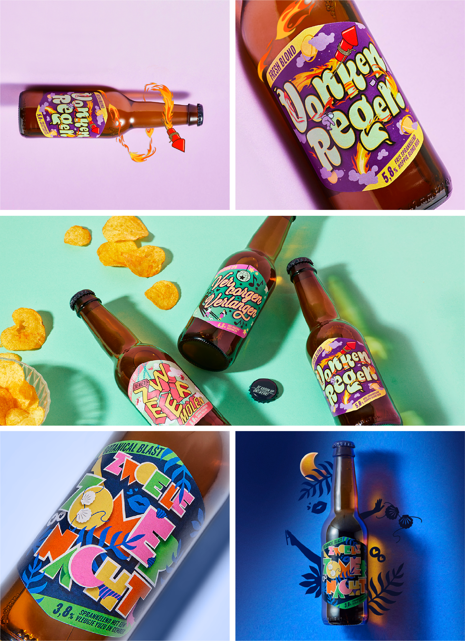
Our solution: the concept of 'The Name of the Game.' Each beer receives an inspiring, wondrous name. The name serves as the starting point of a journey that you get to interpret yourself as you taste the beer. The handcrafted typography takes the (design) spotlight, varying for each flavor. The typography on the label is complemented by many surprising details in the 'world' around it. Together, they form a unity with the prominent product name. Just like the beer itself, the bottle becomes a small exploration. Now, you might be wondering, 'What will these beers be named?' Here they are:
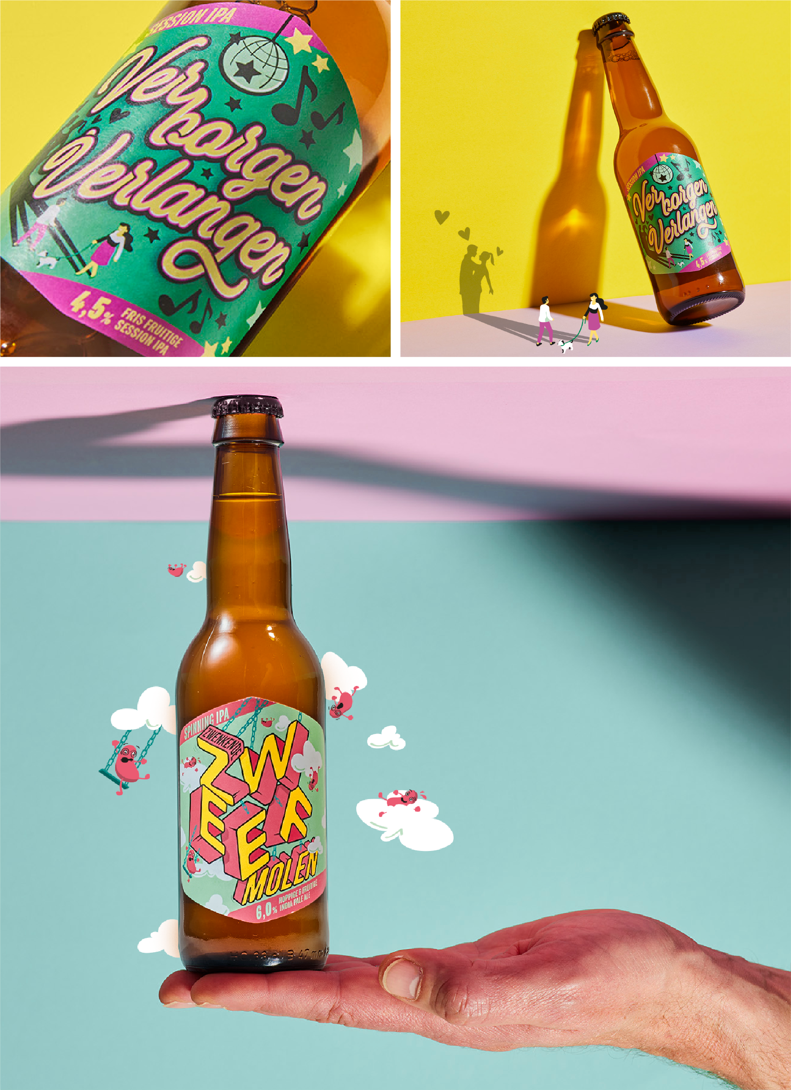
- 'Zwenkende Zweefmolen' (Swirling Carousel): a slightly heavier beer. You'll feel this one faster—just like being on a carousel! On the packaging, the letters swirl around as if hanging from a carousel. The pink characters add an extra dose of humor.
- 'Vonkenregen' (Spark Shower): a sparkling beer. This one features a space theme combined with flying, crackling fireworks. An astronaut, planets, and lots of fire make the design especially lively. Sparkling = fireworks in your mouth!
- 'Zwoele Zomernacht' (Sultry Summer Night): a botanical beer, perfect for a sultry summer night. On the label, you'll see rustling in the bushes: limbs and clothing flying around. A wild summer night!
- 'Verborgen Verlangen' (Hidden Desire): a fruity beer. On the packaging, you'll see two people secretly longing for each other: take a close look at their shadows!
Despite the significant differences in color usage and typography, Gulpener's range remains cohesive. How did we achieve this? By adding small, subtle binding elements that create a unified whole. The labels share the same shape, and the flavor descriptions at the bottom of the label are presented in the same way. A colorful ensemble that we're proud of!
Het team
Design: Xander van Miltenburg
Project management: Marc Terlien
Illustratie: Nick van Oosten