From a passion for popcorn and cozy family nights to popcorn you just can't resist!
Pop A Smile's Challenge
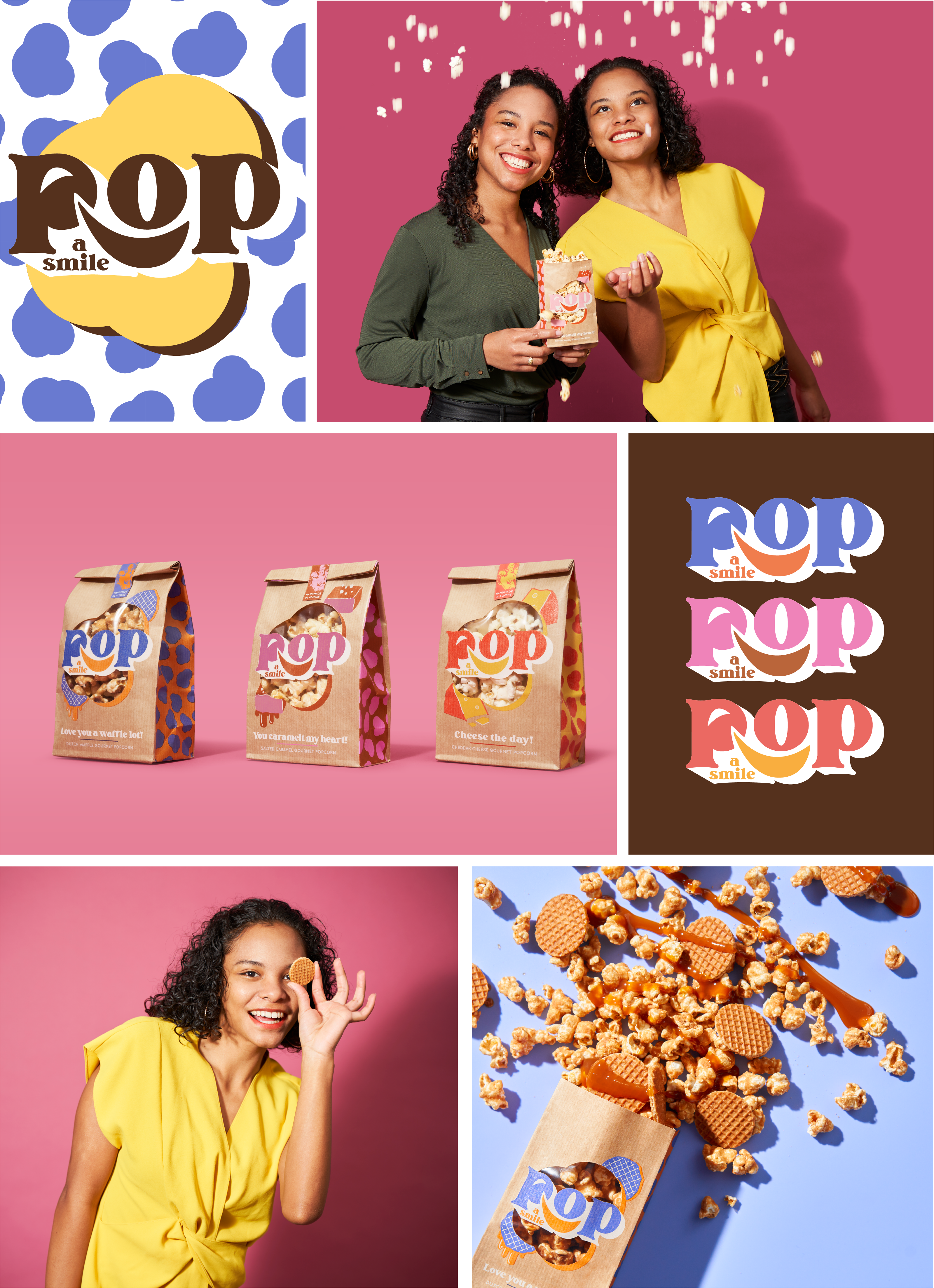
The two young entrepreneurs, Yuandi and Charissa de Herdt, started their own popcorn brand called "Yummy Popcorn," focusing on connection and togetherness.
"We want to become the Ben & Jerry's of popcorn," the girls said modestly. With this humble quote comes a modest branding approach. How do you establish the visual identity for a new product or brand, using the company's core values as a starting point?
The solution
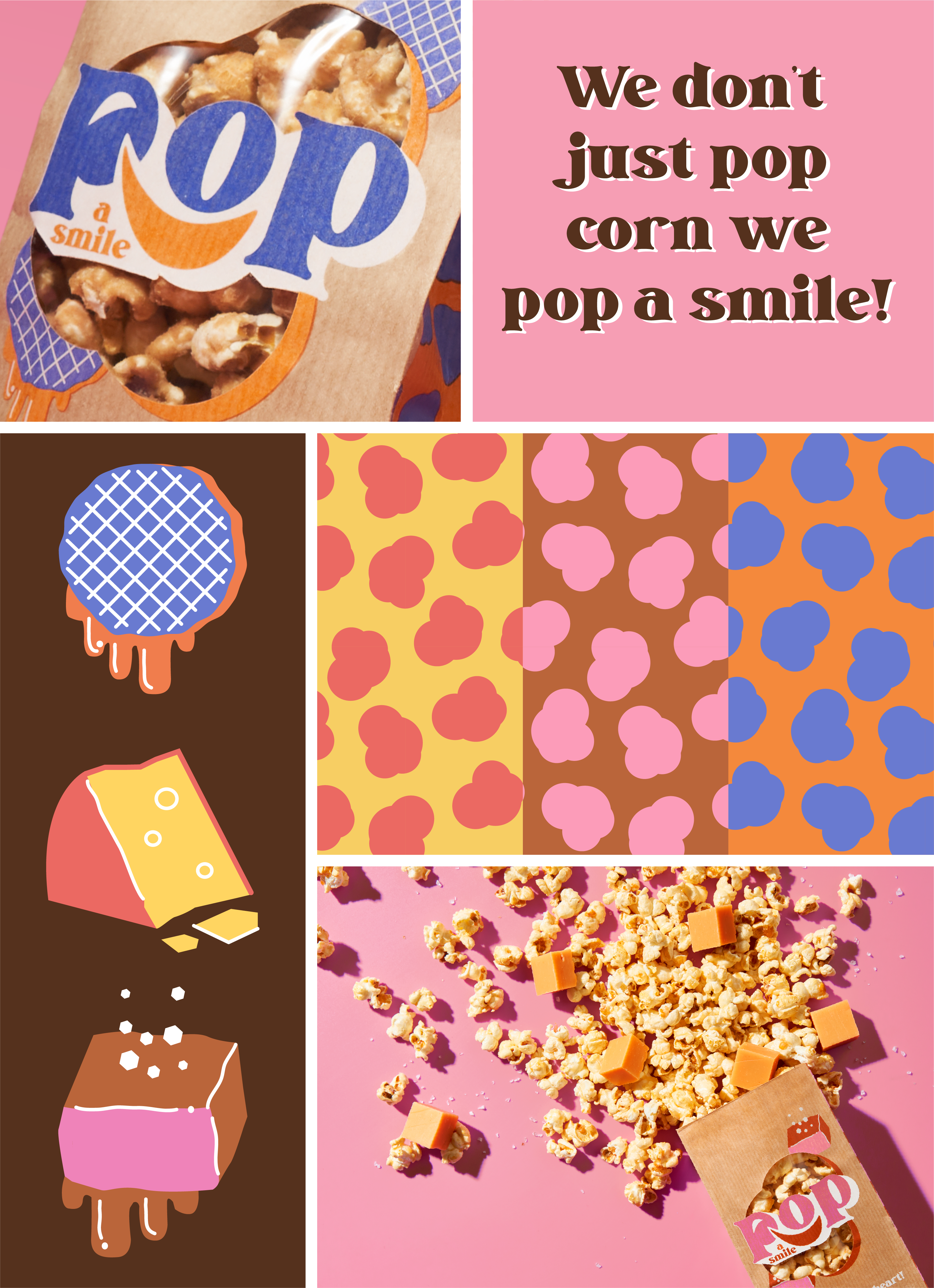
Focus on what makes Yuandi and Charissa's popcorn unique and a new name emerged: 'Pop a Smile.' It's a name that perfectly aligns with the mission: connecting people and bringing smiles to faces is paramount for the brand.
Branding Alongside the new name, packaging, various visual elements, and a food truck with matching merchandise were designed.
Key visual elements that constitute the packaging and provide brand recognition:
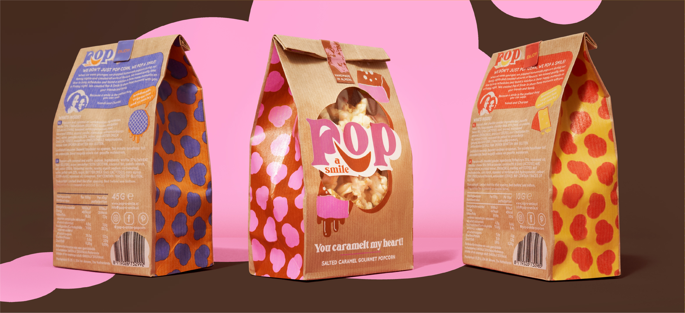
- The product as a Hero: unconventional flavors and packaging that bring a smile. Smiles are incorporated in various ways: you'll see a smile beneath the logo and a smiling corner by the letter P. Popcorn equals fun. You can't miss it!
- A viewing window: the sisters craft the popcorn themselves using only real ingredients. Real ingredients play a significant role, hence the use of a transparent window. This allows you to admire the popcorn live. Tasty popcorn deserves to be seen and is literally at the center.
- Colors and illustrations: each flavor distinguishes itself with unique colors, while the kraft paper brings everything together. The colors and style are cheerful and retro. Each flavor has its illustration, displaying the ingredients in a comic-like drawing. The use of kraft paper gives a handmade feel, combined with bold and fun colors for contrast, providing a youthful appearance.
- Popcorn pattern: on the side of each package, you'll find a pattern composed of popcorn, showcasing the colors corresponding to each flavor. This creates a colorful unity across the packaging.
- Retail and Food Truck: brand recognition is vital since the packaging will be used both in Retail and the food truck. Moreover, the bags in the food truck can be directly filled with freshly baked popcorn, and those same bags are suitable for sale in retail/hospitality.
The packaging: a surprising size.
Popcorn is often seen as a bulk product, with large bags and tubs to devour as much popcorn as possible. While that's great, Pop A Smile is meant for conscious enjoyment. Hence, an unconventional choice in the world of popcorn: small packaging. Perfect for savoring, great for sharing, and perhaps a good way to protect oneself too ;-)