Kruidvat is there for everyone. Because every consumer should be able to feel beautiful, good, and healthy. That's what the drugstore formula aims to convey with its Private Label products. You're probably familiar with their ever-surprising-always-affordable jingle. The quasi carelessly organized chaos in the store is probably well-known too. Customers love it! But how do you ensure that the broad Private Label assortment stands out? Kruidvat asked us to develop a unified design language incorporating their latest brand values.
From sex toys to hairspray
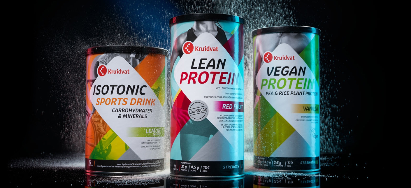
The challenge was to create recognizability for Kruidvat's private label products. But at the same time, to make every category (baby, body, beauty, and health) shine in a retail shelf where visual competition is fierce. The goal was to surprise and tempt people into not being able to resist that can of hairspray or that jar of baby food, the painkillers, face cream, shower gel, vibrator, protein shake, and all the other private label products. In fact, the Private Label products should be the reason for visiting the store.
We play Cupid
At Brum, we find this an incredibly fun and challenging task. Because with good packaging design, you can truly make an impact. After all, a shopper literally takes a piece of Kruidvat home and sometimes holds it daily. It's not just a fleeting encounter but a serious relationship! An excellent opportunity to convey the brand identity and win a place in the hearts of consumers. With our design, we aimed to ensure that Kruidvat's products stand out, tempt purchases, and gain lasting fans.
Stand out and shine
As a retailer, you only have a few seconds to grab your customer's attention on the store shelf. You never get a second chance to make a first impression. That's why it has to be right at once. Therefore, we designed a dynamic white area as the basis for each package. Good for recognition in the colorful shelf. For each product category, we gave it a different shape and played with color and typography for the background. This gave each category its own attractive look. It matched the brand values and different experiences per product type, allowing people to navigate smoothly through the store.
A good story
But not only does the eye want something, a smooth talk is just as important. The white shape is not only a recognizable visual focal point but also a platform for USPs (Unique Selling Points) and essential product information. It's clear in the spotlight, with the Kruidvat logo as a fixed factor. It's the connection between the logo and the white focus shape that makes the private label products a true statement. They stand out on the shelf, are easy to find, and clearly belong together.
Together, so much fun!
Those who know us know that we love nothing more than collaborating, with each other and with our clients. In this case, also with other agencies. Due to the volume of Kruidvat's items, three design agencies work on the designs. Our design language forms the basis. By designing a dynamic grid for this purpose, we provided the other agencies with frameworks in which they could still be creative. And that's what makes our work so enjoyable. We can inspire each other to create a real change together. And thus, conquer the hearts of consumers.