Unbrakeable fun, back in top gear.
The challenge
AutoDrop is so loved that fans get tattoos of it. That's something you want to keep. The thing is, the world is changing. A new, younger group of buyers, new channels, new creators. And with that: more brand touchpoints than ever. More and more agencies were working on brand communications, while the existing brand book and brand assets didn't offer enough guidance to keep AutoDrop consistent everywhere: cheeky, absurd and unmistakably AutoDrop. The brand's look and feel became fragmented. At the same time, the range kept growing, which blurred the differences within the product portfolio – not what you want in the competitive sweets aisle. Time for a brand tune-up.
The solution
We gathered the existing strategic principles and used them to sharpen the brand character: likeably rebellious, unbridled, direct and playful. Never childish. For anyone who finds the day just a little too serious at times and wants to let loose for a moment (and is old enough to drive). Then we brought order to the chaos:
- We improved the portfolio architecture, so you can see at a glance what you're grabbing;
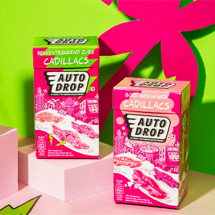
- We modernised the brand identity and strengthened recognition: a more powerful logo, candy cars that really pop and a bolder illustration style;
- We developed more (and clearer) brand assets, so teams and agencies don't have to guess but can just hit the road – across every touchpoint of today;
- We captured everything in a brand book, so content, campaigns and packaging speak the same language again.
And yes, the humour stayed. Not a thousand little jokes, but a few big, absurd hooks that stick with you: the quirky fact under the lid. And that flamingo that suddenly pops up as if it's the most normal thing in the world.
The result
AutoDrop is steering a clear course again. More clarity in the portfolio, more consistency in the brand and, soon, greater recognition at every touchpoint.
In tests, the new packaging design outperformed the existing one and scored higher on appeal and clarity. With scalable brand assets, AutoDrop now has a foundation that grows with it – without losing its cheeky character.
Ready to race into the future!

In the client's words
"Autodrop is a rock-solid brand, firmly in third place in the sweets category for awareness, preference and consideration. That means we're well established in consumers' minds. Branding and packaging naturally play a crucial role in that. Brum has been our design agency for 15 years and has an unerring feel for the brand.
In 2018, after ten years with the same design, we took a big step forward with our packaging. Seven years later, it was time for another round of optimisation. Not a revolution, but a well-considered evolution. The design contained too many elements, which sometimes made communications unnecessarily busy. On top of that, the small humorous details were getting lost, and flavour recognition on the packs could be clearer.
With this optimisation, Autodrop stands out more on the shelf, the brand is quicker to find and it holds attention for much longer. Eye-tracking research also shows that brand associations and likeability are being reinforced even more strongly.
All in all, a great next step for the brand. Thanks to Brum for the wonderful collaboration!"
The team
Strategy: Tessa Oudijn
Design: Sanne de Wit, Tessa Oudijn
Project management: Dagmar Schoonhoven
Artwork: Vijay Sardjoe
Illustration: Nick van Oosten
Photography: Daan Verschuur
Retouche: Fred Rietveld