Entertaining and surprising? Leave that to us. That was the request from Autodrop – the whimsical jester of the candy aisle. After a few years, it was truly time to breathe new life into the brand, including a fresh packaging redesign.
The challenge
Autodrop believes life should be celebrated more, not just on special occasions but also on ordinary weekdays. The brand sharply embraces the fun factor with a distinct and quirky style. To encourage impulse buying, the decision based on the packaging should be made swiftly. That was precisely the guiding principle behind the restyle: instantly wild and wacky. It was time to breathe new life into the brand!
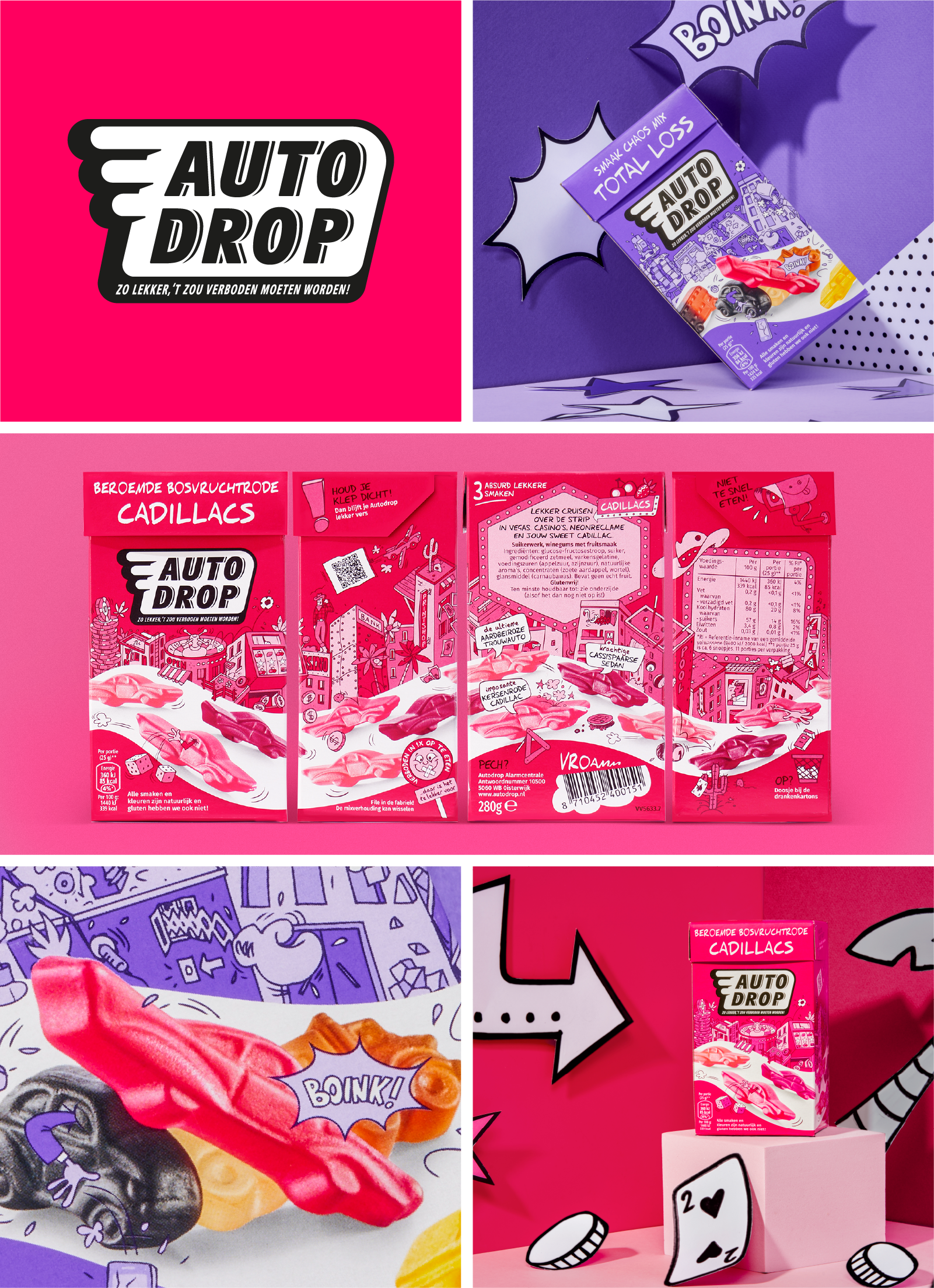
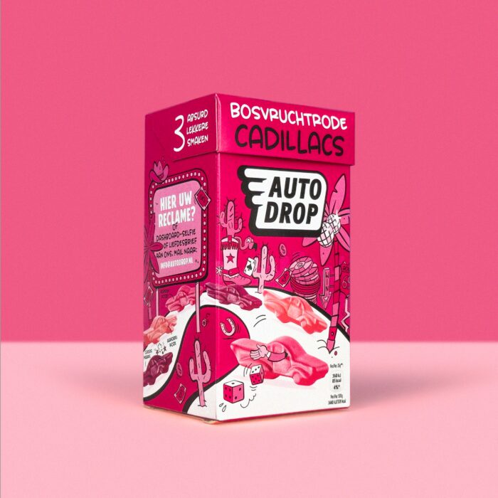
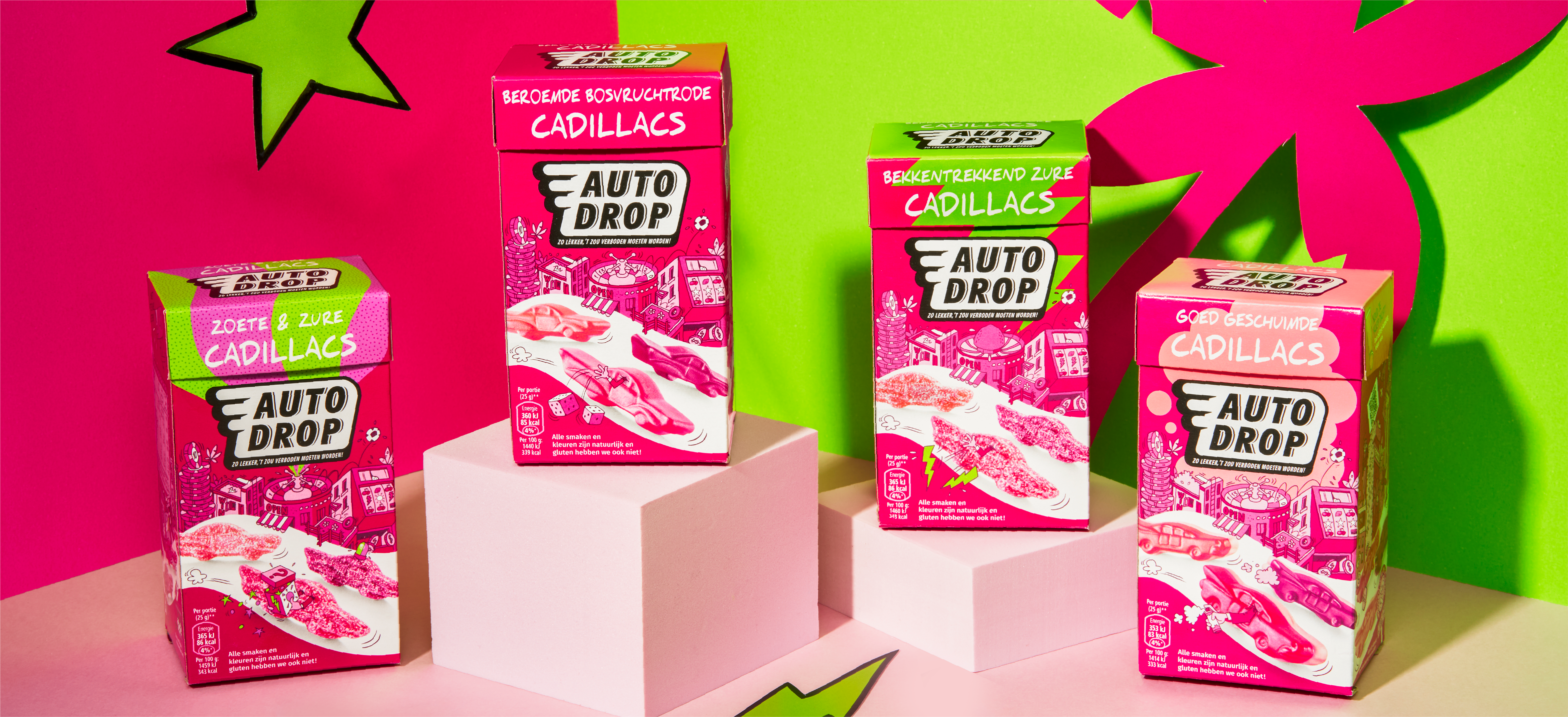
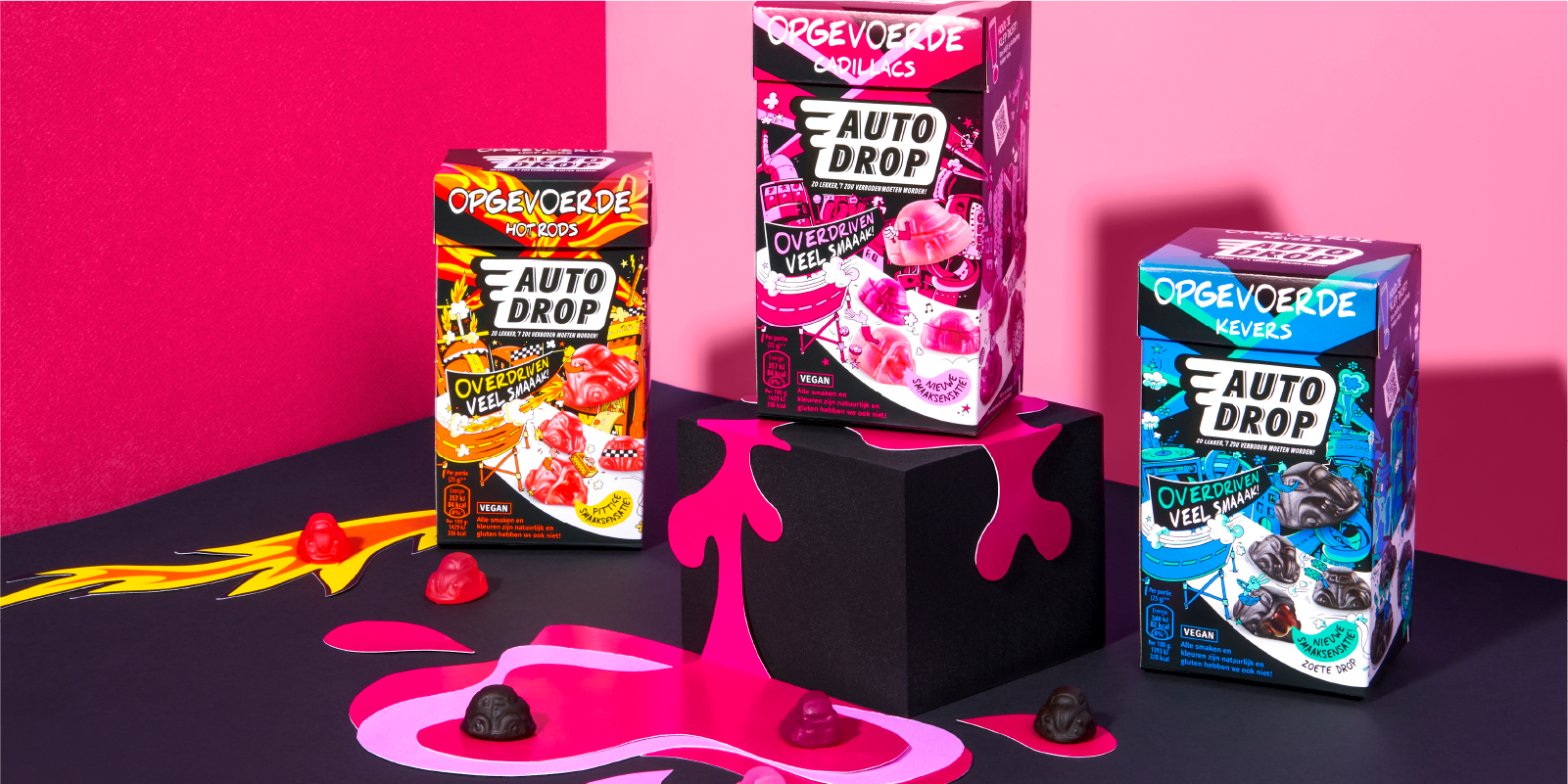
De solution: wildly fun universes
One of the changes we implemented was the logo. "We weren't really allowed to touch it, but it truly gives the design and brand the impulse it needed," designer Saskia explains. "Additionally, a new world was illustrated for each type of licorice. Nick van Oosten did an amazing job translating our brief into fantastic illustrations – and I mean that literally!"
From sandwiches leaping out of buildings to smiling octopuses: in these fun worlds, nothing is too outlandish. Amidst these, the 3D Autodrop candies navigate winding roads that run across the entire packaging. "That was quite a task," says Erik, senior DTP specialist. "All the individual elements had to remain clearly visible and perfectly align everywhere. We also ensured the road continues across the different variations."
With the same attention to detail, we added small jokes and clever details throughout the packaging – even in the most secretive spots. The new Autodrop thus returns to the origin of the iconic brand: with fun, cheerfulness, and a cheeky wink. "It's become even more Autodrop than it already was," says Tessa, co-owner and creative director of Brum. "Without losing recognition, we needed to strike a balance that merged the heart of the brand with innovation. And we think we've succeeded quite well.
The result
And it's not just us who's convinced: "Due to the lower consumer engagement and loyalty in the overcrowded candy aisle, Autodrop really needs to stand out – and we truly are doing that again," explains marketing manager Annemarie van Eenennaam. "Moreover, it's not just about the packaging; Brum also contributed to the strategy, refining the positioning, and translating it into communication. That makes everything just fit together perfectly now."
From front to back, surprise and entertainment. Truly Autodrop, and truly Brum!
Het team
Design: Saskia Berting, Sanne de Wit
Artwork: Vijay Sardjoe
Project management: Ramon Remkes
Fotografie: Daan Verschuur
Beeldbewerking: Fred Rietveld
Illustratie: Nick van Oosten