


An organic future tastes the best!
The challenge
Since 1979, OFC has been a pioneer in organic herbs and spices. With over 45 years of experience under their belt, there’s no organic challenge they can’t tackle. OFC supplies bulk ingredients to industry, adds organic seasonings to base products, and can even deliver complete concepts, from product to label. Everyone at OFC is incredibly proud and passionate about the company. But how do you tell such a rich, specific and unique story to the outside world? What truly matters. Not just internally, but to their clients as well? It was time to sharpen OFC’s distinctive strength and relevance, and give the company a visual identity that highlights what truly sets them apart. All wrapped up in a look and feel that’s firmly rooted in today. The ambition? To make OFC the go-to partner for anyone looking to bring an organic, flavourful product to market.
The solution
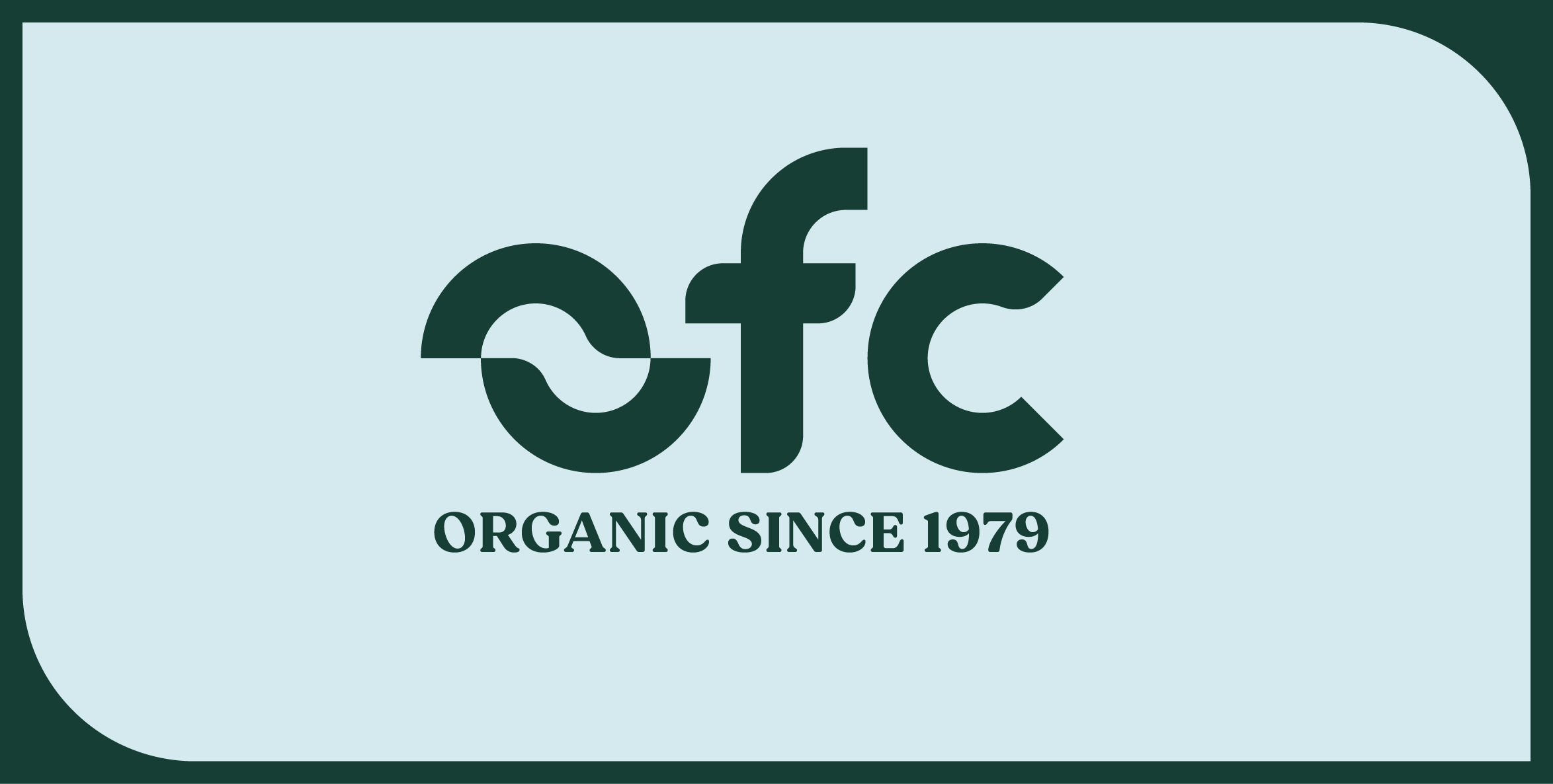
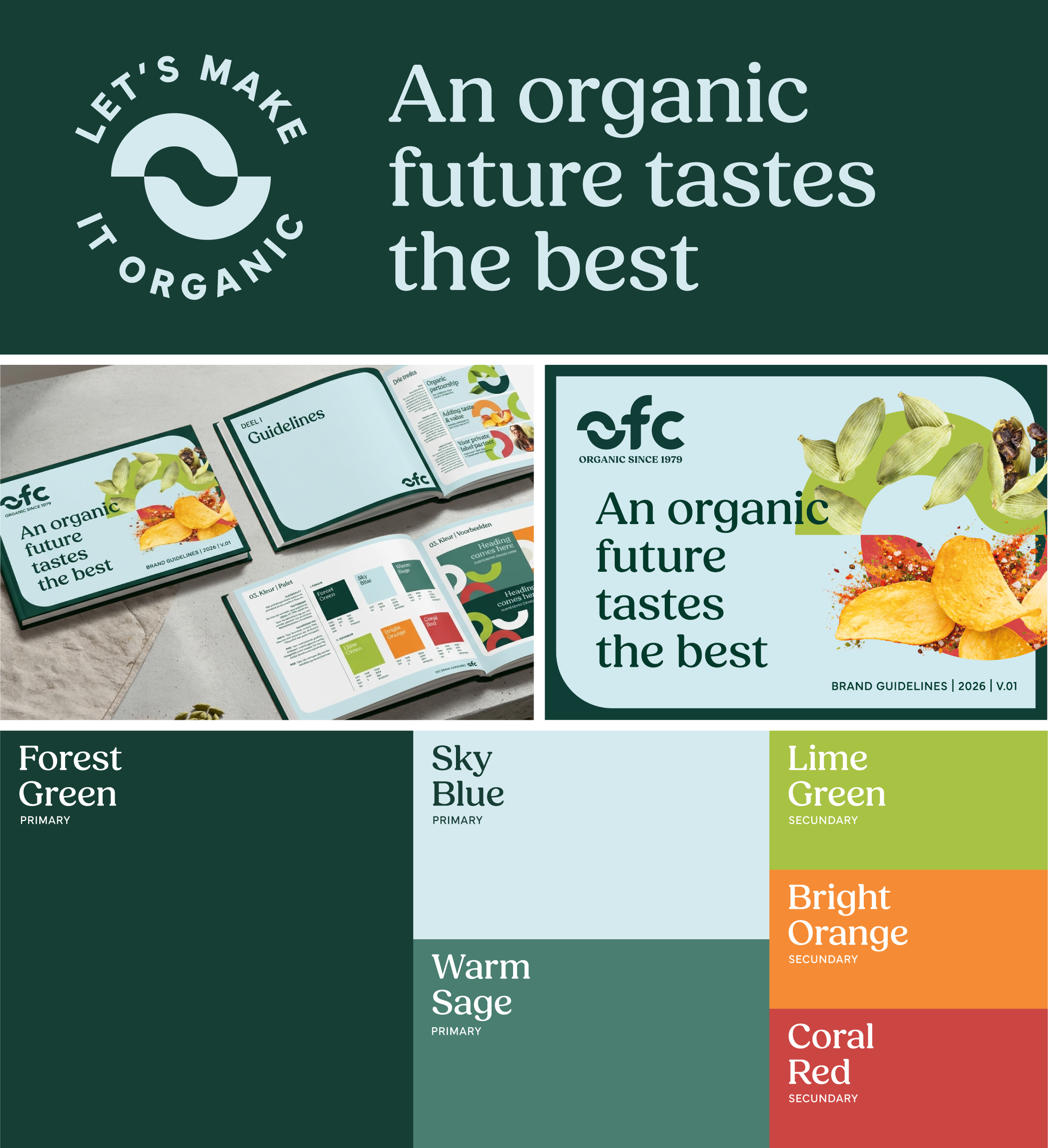
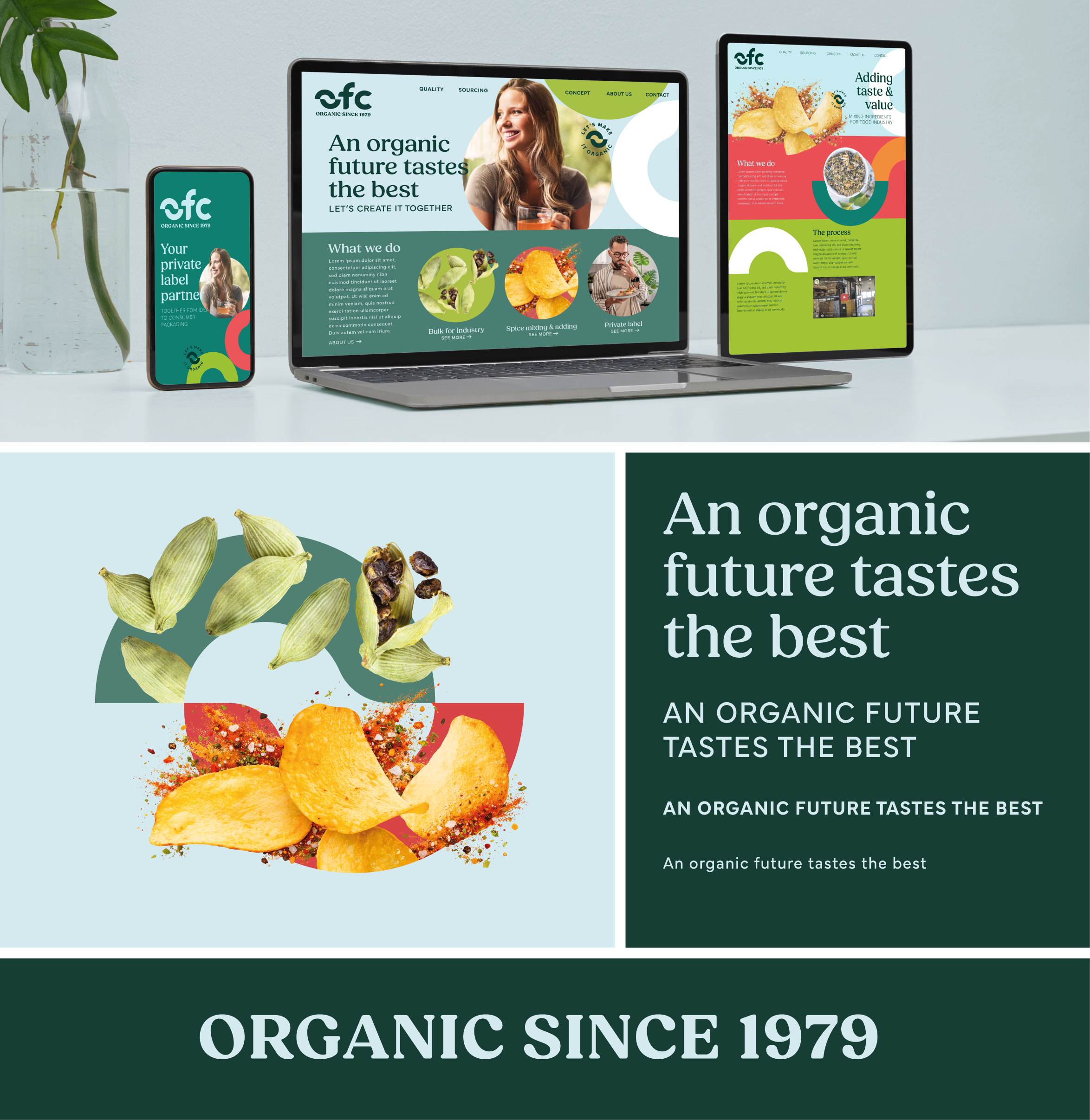
Together with OFC employees from different disciplines, we explored the challenge in a strategic session full of sharp questions. We uncovered the core of the brand: its identity, distinctive strength and relevance. The outcome was a strategic document that became the foundation for OFC and provided a clear brief for the redesign. One of the key takeaways: OFC is the transformative link between idea and reality, turning a base ingredient into a finished product full of flavour. This connecting link became the foundation for the new logo. The ‘O’ consists of two interlocking links, with a leaf emerging from the negative space. These links became a recognisable brand asset, dynamically used as a graphic element and photographic lock-up. The typography is friendly and trustworthy, while the colour palette is bold and full of flavour. OFC’s three service branches each received slightly different guidelines, allowing us to speak to every (potential) client as directly as possible while always remaining unmistakably OFC.
The result
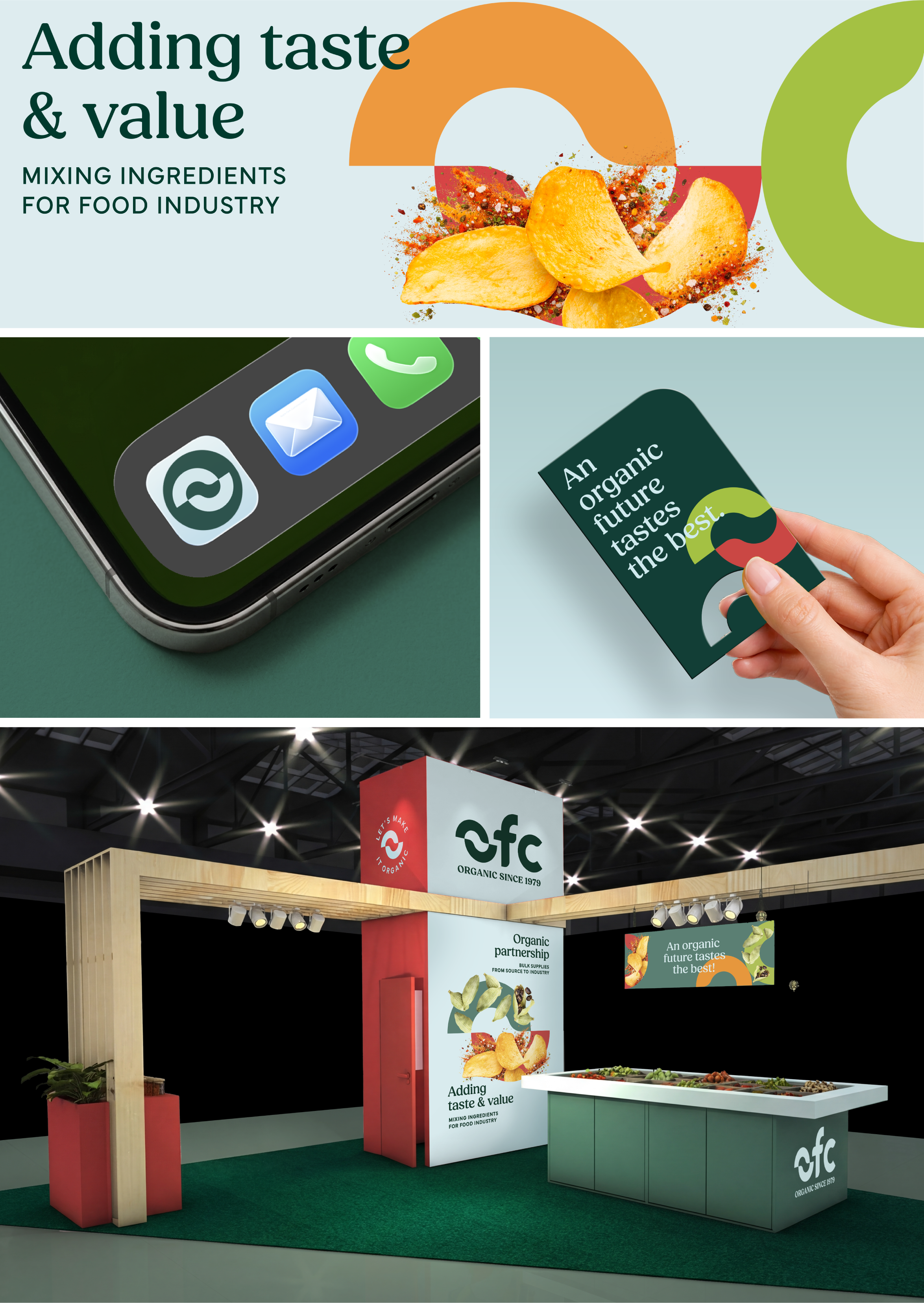
OFC now has a sharper story than ever. And: a face that seamlessly brings it to life. A brand with the power to build recognition and continue building on everything that has been achieved over decades. We captured all strategic and visual principles in a brand book, ensuring the OFC identity is felt across every touchpoint and speaks with one consistent voice. Here’s to a flavourful future. And it’s organic!
“We started this adventure together with lots of energy and confidence. Our long-standing relationship and experience with the Brum team in the field of packaging design formed a good foundation to do this together with Brum as well. They have created a strong design and a brand identity that can be applied across the board. This gives our organisation and all OFC employees an extra boost. It’s great to be able to do this together with Brum as well. Thank you for all your knowledge, creativity and the great strategic sessions!”
- Vendie Kroesbergen, Marketing & Private Label
The team
Strategy: Lisa van Diemeren
Design: Xander van Miltenburg, Lisa van Diemeren
Account Management: Kim Snapper
Artwork: Nancy Prins